本文将以一个 loading 动画为例,介绍 SVG 路径描边动画相关属性和实现原理,一起了解吧!
相关属性介绍
viewBox 画布大小
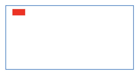
首先我们设置一个200 * 100大小的SVG,里面有一个20 * 10大小的矩形。
<svg width="200" height="100" style="border:1px solid #207ad6;">
    <rect x="10" y="5" width="20" height="10" fill="red"/>
</svg>
效果如下图所示:
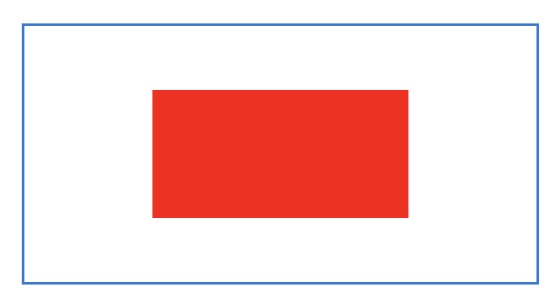
接着我们给这个SVG添加 viewBox 属性 0,0,40,20。
<svg width="200" height="100" viewBox="0,0,40,20" style="border:1px solid #207ad6;">
    <rect x="10" y="5" width="20" height="10" fill="red"/>
</svg>
结果如下:
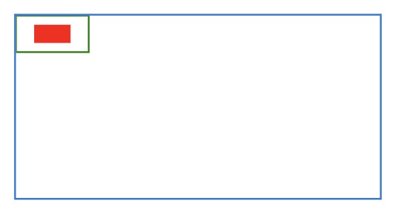
viewBox 共有四个属性,分别是 x:左上角横坐标,y:左上角纵坐标,width:宽,height:高。所以,viewBox 设置的区域相当于下图中左上角绿色框的区域:
设置了 viewBox 之后,就会将 viewBox 属性设置的区域,按照一定的比例放大到整个SVG的显示区域。所以,我们看到20 * 15的矩形在200 * 150的SVG下居中显示。
stroke-dasharray 虚线描边
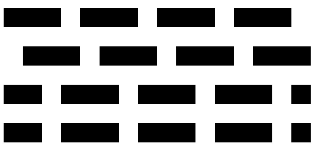
stroke-dasharray 的值是一个长度或百分比的数列,数与数之间用逗号或者空白隔开,依次指定短划线和缺口的长度。

<svg viewBox="0 0 30 10">
  <line x1="0" y1="1" x2="30" y2="1" stroke="black" />

  <line x1="0" y1="3" x2="30" y2="3" stroke="black" stroke-dasharray="4" />

  <line x1="0" y1="5" x2="30" y2="5" stroke="black" stroke-dasharray="4 1" />

  <line x1="0" y1="7" x2="30" y2="7" stroke="black" stroke-dasharray="4 1 2" />

  <line x1="0" y1="9" x2="30" y2="9" stroke="black" stroke-dasharray="4 1 2 3" />
</svg>
- 第一条线:是没有设置stroke-dasharray的实线
- 第二条线:设置了stroke-dasharray: 4,所以短划线和缺口的长度都是4
- 第三条线:设置了stroke-dasharray: 4 1,短划线长度为4,缺口长度为1
- 第四条线:设置了stroke-dasharray: 4 1 2,依次是短划线为4,缺口为1,短划线为2,缺口为4,短划线为1,缺口为2,以此类推
- 第五条线:设置了stroke-dasharray: 4 1 2 3,依次是短划线为4,缺口为1,短划线为2,缺口为3,以此类推
stroke-dashoffset 虚线起始偏移量
stroke-dashoffset 指定了dash模式到路径开始的距离,整数可视窗口向后移动,负数可视窗口向前移动。
<svg viewBox="0 0 16 10">
  <line x1="0" y1="3" x2="16" y2="3" stroke="black" stroke-dasharray="3 1" />

  <line x1="0" y1="5" x2="16" y2="5" stroke="black" stroke-dasharray="3 1" stroke-dashoffset="3" />

  <line x1="0" y1="9" x2="16" y2="9" stroke="black" stroke-dasharray="3 1" stroke-dashoffset="1" />

  <line x1="0" y1="7" x2="16" y2="7" stroke="black" stroke-dasharray="3 1" stroke-dashoffset="-3" />
</svg>
我们设置了一条 stroke-dasharray: 3 1 的虚线,即短划线长度为3,缺口长度为1。虚线的长度为16,即可视窗口的长度为16。
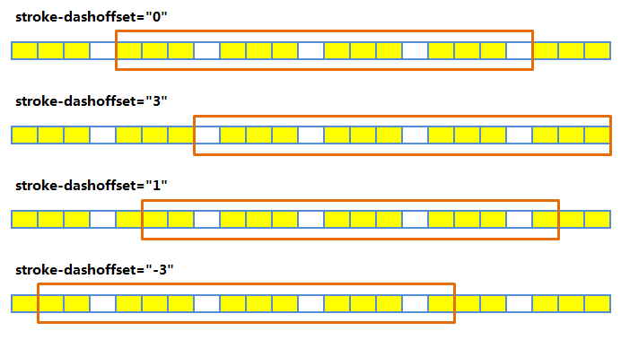
- stroke-dashoffset: 3,相当于将可视窗口往后移动了三格,所以我们看到第二条线是以空格开始的
- stroke-dashoffset: 1,相当于将可视窗口往后移动了一格,所以我们看到第三条线是以短划线长度为2开始的
- stroke-dashoffset: -3,相当于将可视窗口往前移了三格,所以我们看到第四条线还是以短划线长度为2开始的
两张图对比进行观察,更易于理解。
SVG实现loading动画
效果如下图所示:
下面我们将详细讲解这个动画是如何实现的。
动画分解
- 0% ~ 50%:从一个小点变成一个四分之三的圆弧,并且带有一点偏移量。
- 50% ~ 100%:从四分之三圆弧变为一个点。
动画绘制
首先,画一个圆
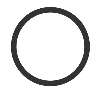
<svg viewBox="0 0 50 50" style="width: 60px; height: 60px">
    <circle cx="25" cy="25" r="20" fill="none" stroke="#333" stroke-width="3"></circle>
</svg>
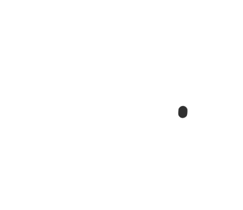
- 0%:画一个点
圆周长:2 * 3.14 * 20 = 125.6
<svg viewBox="0 0 50 50" style="width: 60px; height: 60px">
    <circle cx="25" cy="25" r="20" fill="none" stroke="#333" stroke-width="3" stroke-dasharray="1 200"></circle>
</svg>
我们将圆的 stroke-dasharray 的值设为 1 200,使得短划线长度为1,缺口长度为200,因为圆的圆周长约等于 125.6,所以缺口长度远大于圆周长度,使得SVG显示为一个点。
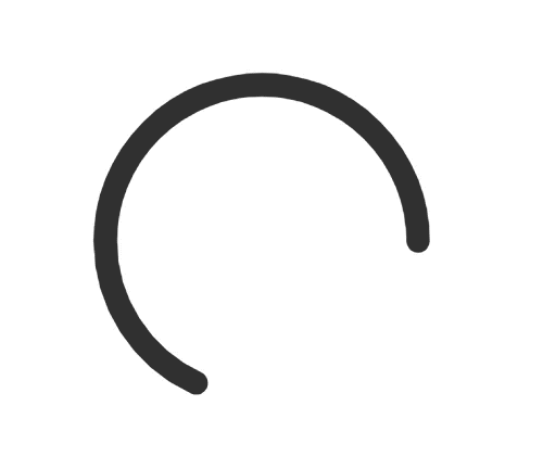
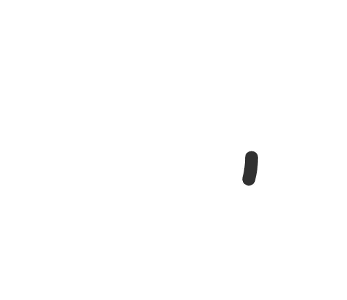
- 50%:画四分之三圆弧
125.6 / 4 * 3 = 94.2
<svg viewBox="0 0 50 50" style="width: 60px; height: 60px">
    <circle cx="25" cy="25" r="20" fill="none" stroke="#333" stroke-width="3" stroke-dasharray="90, 150"></circle>
</svg>
我们将圆的 stroke-dasharray 的值设为 90 150,使得短划线长度为90,缺口长度为150,因为短划线长度占圆周长约四分之三,缺口长度远大于圆周长的四分之一,使得SVG显示为四分之三圆弧。
- 添加动画,就形成从一个点变成四分之三圆弧的效果:
<svg viewBox="0 0 50 50" style="width: 60px; height: 60px">
    <circle class="spin-path" cx="25" cy="25" r="20" fill="none" stroke="#333" stroke-width="3" stroke-dasharray="5, 200"></circle>
</svg>

<style lang="scss">
.spin-path {
    animation: spinDash 1.5s ease-in-out infinite;
    stroke-linecap: round;

    @keyframes spinDash {
        0% {
            stroke-dasharray: 1, 200;
        }
        50% {
            stroke-dasharray: 90, 150;
        }
        100% {
            stroke-dasharray: 90, 150;
        }
    }
}
</style>
- 0% ~ 50%时,我们发现圆从一个点变成一个四分之三圆弧的过程中时,是带有约四分之一距离的偏移,我们可以通过
stroke-dashoffset来实现这一效果。
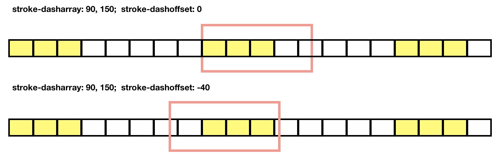
我们将可视窗口往前移动40个单位,即 stroke-dashoffset 的值为 -40。我们从上图可以看到,当我们将 stroke-dashoffset 的值从 0 变为 -40 时,圆弧长仍然是四分之三,但是可视窗口偏移了四分之一。
<svg viewBox="0 0 50 50" style="width: 60px; height: 60px">
    <circle class="spin-path" cx="25" cy="25" r="20" fill="none" stroke="#333" stroke-width="3" stroke-dasharray="5, 200"></circle>
</svg>

<style lang="scss">
.spin-path {
    animation: spinDash 1.5s ease-in-out infinite;
    stroke-linecap: round;

    @keyframes spinDash {
        0% {
            stroke-dasharray: 1, 200;
            stroke-dashoffset: 0;
        }
        100% {
            stroke-dasharray: 90, 150;
            stroke-dashoffset: -40px;
        }
    }
}
</style>
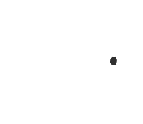
- 50% ~ 100%时,圆从四分之三圆弧变为了一个点。
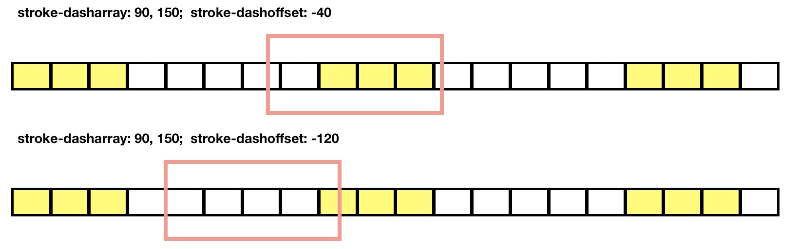
这也是通过修改 stroke-dashoffset 属性的值实现的。当我们将 stroke-dashoffset 的值从 -40 变为 -120 时,可视窗口继续往前移动,圆弧的显示长度变为 125.6-120=5.6,从而实现了圆从四分之三圆弧变为了一个点的效果。
<svg viewBox="0 0 50 50" style="width: 60px; height: 60px">
    <circle class="spin-path" cx="25" cy="25" r="20" fill="none" stroke="#333" stroke-width="3" stroke-dasharray="5, 200"></circle>
</svg>

<style lang="scss">
.spin-path {
    animation: spinDash 1.5s ease-in-out infinite;
    stroke-linecap: round;

    @keyframes spinDash {
        0% {
            stroke-dasharray: 90, 150;
            stroke-dashoffset: -40px;
        }
        100% {
            stroke-dasharray: 90, 150;
            stroke-dashoffset: -120px;;
        }
    }
}
</style>
- 动画合并:最后,我们将 0% ~ 50% 和 50% ~ 100% 的动画进行合并,并且给SVG一个
rotate(0deg)到rotate(360deg)的动画,就形成了前文提到的loading效果了。
<svg viewBox="0 0 50 50" style="width: 60px; height: 60px">
    <circle class="spin-path" cx="25" cy="25" r="20" fill="none" stroke="#333" stroke-width="3"></circle>
</svg>

<style lang="scss">
svg {
    animation: loading-rotate 2s linear infinite;
}

.spin-path {
    animation: loading-dash 2s ease-in-out infinite;

    stroke-dasharray: 90, 150;
    stroke-dashoffset: 0;
    stroke-linecap: round;
}

@keyframes loading-rotate {
    100% {
        transform: rotate(360deg);
    }
}

@keyframes loading-dash {
    0% {
        stroke-dasharray: 1, 200;
        stroke-dashoffset: 0;
    }
    50% {
        stroke-dasharray: 90, 150;
        stroke-dashoffset: -40px;
    }
    100% {
        stroke-dasharray: 90, 150;
        stroke-dashoffset: -120px;
    }
}
</style>
简单的SVG路径描边动画

通过 PS 或 AI 导出文字路径的 SVG,通过 getTotalLength() 方法获取路径长度。上图的例子的路径长度是 1446。我们给 path 设置 stroke-dasharray: 1446 ,即短划线和缺口长度都为 1446。当 stroke-dashoffset 的值为 0 时,E字母是完整显示的,当 stroke-dashoffset 的值为 1446 时,显示区域移动至缺口区域,所以此时E字母就消失了。通过动态调整 stroke-dashoffset 的值,就形成上图简单的SVG路径描边动画了。
<svg xmlns="http://www.w3.org/2000/svg" xmlns:xlink="http://www.w3.org/1999/xlink" width="175px" height="319px" >
    <path fill-rule="evenodd"  fill="none" stroke="#333" stroke-width="3" d="M174.527,278.406 L49.109,278.406 L49.109,172.572 L160.777,172.572 L160.777,132.571 L49.109,132.571 L49.109,40.487 L167.444,40.487 L167.444,0.070 L0.775,0.070 L0.775,318.824 L174.527,318.824 L174.527,278.406 Z"/>
</svg>

<style>
svg > path {
    stroke-dasharray: 1446;
    animation: demo 3s ease-in-out infinite;
}

@keyframes demo {
    0% {
        stroke-dashoffset: 1446;
    }
    100% {
        stroke-dashoffset: 0;
    }
}
</style>
SVG动画实现方式
根据 W3C 官方文档,SVG动画有如下实现方式:
- Using SVG’s animation elements
- Using CSS Animations
- Using CSS Transitions
- Using the SVG DOM
- Using the Web Animations API